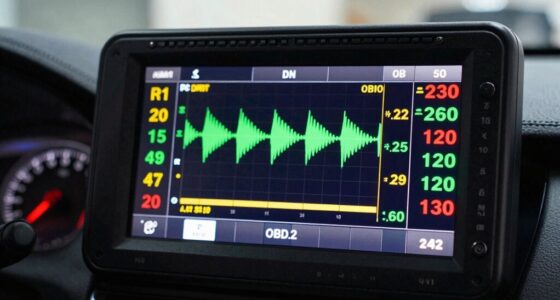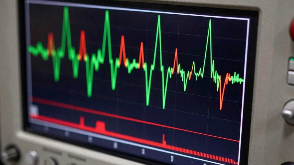

When analyzing sensor graphs, look for sudden spikes or dips, which often signal abnormal conditions like overheating or pressure leaks. Jagged or irregular lines can indicate sensor malfunctions or disturbances, while consistent, predictable shapes suggest proper operation. Recognizing these trouble signals quickly helps prevent minor issues from worsening. If you pay close attention to these visual cues, you’ll spot problems early and make better decisions—more details on how to interpret these shapes await you.

Get business pricing on garage and car supplies
- Business-only prices and quantity discounts
- Tax-exempt purchasing
- Multiple users, one account, clear invoices
Key Takeaways
- Consistent, smooth lines indicate normal sensor operation; sudden spikes or dips signal potential issues needing investigation.
- Jagged or irregular graph shapes often suggest sensor malfunction or external disturbances affecting readings.
- Sharp temperature or pressure changes on the graph may indicate environmental anomalies like overheating or leaks.
- Deviations from expected patterns help identify calibration errors or sensor drift over time.
- Visual cues such as abrupt shifts or abnormal fluctuations allow quick detection of abnormal conditions.

Have you ever wondered how sensors turn complex data into understandable visuals? It’s a fascinating process that relies heavily on sensor calibration and data visualization techniques to make sense of the information collected. When sensors gather data—whether temperature, pressure, or motion—they produce raw signals that can be difficult to interpret. That’s where sensor calibration comes in. By fine-tuning sensors to guarantee their readings are accurate and consistent, you lay the foundation for reliable data visualization. Proper calibration reduces errors and assures that the graphs you see truly reflect what’s happening in the real world. Additionally, understanding the importance of sensor accuracy can help you better interpret the graphs and identify issues more precisely. Accurate calibration also depends on proper setup and maintenance, which ensures the data remains trustworthy over time.
Once calibrated, the data from sensors is translated into visual formats like graphs, charts, or plots. These visual representations help you quickly grasp patterns, trends, or anomalies. Data visualization techniques are indispensable here; they transform raw numbers into shapes and lines that reveal insights at a glance. For example, a smooth, steady line on a graph might indicate normal operation, while sudden spikes or dips could signal potential issues. Recognizing these shapes becomes essential—an irregular, jagged line might suggest sensor malfunction or environmental disturbances, signaling you to investigate further.
Understanding sensor graphs involves more than just reading the lines; it’s about interpreting their shapes. Consistent, predictable patterns often indicate everything is functioning properly. Conversely, unusual shapes—sharp jumps, dips, or erratic fluctuations—signal trouble. For instance, a sudden spike in temperature on a graph could mean overheating, or an irregular pattern in pressure readings might imply a leak or blockage. Learning to identify these deviations allows you to respond swiftly, preventing minor issues from escalating.
The key is to develop an eye for the typical shapes associated with normal operation and to recognize when data visualization techniques reveal signs of trouble. As you become more familiar with these visual cues, you’ll be better equipped to troubleshoot sensor issues or environmental problems. Keep in mind that good sensor calibration is the first step; without it, even the most sophisticated data visualization techniques can produce misleading graphs. Once calibrated correctly, the shapes on your sensor graphs become powerful tools for quick, effective decision-making. By paying attention to these visual signals, you transform complex data into actionable insights, guaranteeing everything runs smoothly.
As an affiliate, we earn on qualifying purchases.
Frequently Asked Questions
How Do Sensor Graphs Differ Across Various Industries?
Sensor graphs differ across industries because each industry emphasizes specific data patterns and calibration needs. In manufacturing, you focus on detecting irregular shapes indicating machine faults, while in healthcare, you interpret graphs showing essential sign trends. You use sensor calibration to improve accuracy, and effective data visualization makes these differences clear. Recognizing unique graph shapes helps you identify problems quickly, tailoring your approach to each industry’s specific sensor monitoring requirements.
What Are Common Causes of Abnormal Sensor Graph Shapes?
A stitch in time saves nine, and addressing abnormal sensor graph shapes early can prevent bigger problems. Common causes include sensor calibration issues, which lead to inaccurate readings, and data smoothing errors that distort signals. Sudden spikes or dips often indicate malfunctions or external interference. You should regularly verify calibration and apply proper data smoothing techniques to maintain accurate, reliable sensor data and avoid misinterpretations that could cause costly equipment failures.
Can Sensor Graph Anomalies Indicate Sensor Malfunctions?
Yes, sensor graph anomalies can indicate sensor malfunctions. When you notice irregular shapes or unexpected spikes, it might be a calibration issue or interference affecting the data. To confirm, you should perform sensor calibration and apply proper data filtering techniques. These steps help differentiate between actual issues and false anomalies caused by noise, ensuring your readings are accurate and reliable.
How Can I Improve the Accuracy of Sensor Graph Readings?
To improve your sensor graph readings, focus on regular calibration techniques to guarantee accuracy and consistency. Additionally, apply data smoothing methods like moving averages or filters to reduce noise and enhance clarity. You should also verify that the sensor is properly maintained and placed in ideal conditions. Combining these approaches helps you achieve more precise, reliable readings, making it easier to interpret sensor signals effectively.
Are There Software Tools to Automatically Interpret Sensor Graph Patterns?
Yes, you can find software tools that automatically interpret sensor graph patterns using machine learning and pattern recognition. These tools analyze anomalies, alerts, and irregularities, offering intuitive insights. With smart algorithms, they sift through sensor signals swiftly, spotting subtle shifts or spikes. Such software simplifies troubleshooting, saves time, and boosts accuracy, helping you understand complex sensor behaviors effortlessly and efficiently, transforming raw data into actionable insights.
temperature pressure sensor monitor
As an affiliate, we earn on qualifying purchases.
As an affiliate, we earn on qualifying purchases.
Conclusion
Just as Sherlock Holmes used clues to unravel mysteries, you can decode sensor graphs to uncover hidden issues. Recognizing the shapes and patterns signals whether everything’s running smoothly or if trouble brews beneath the surface. Paying attention to these visual cues is your key to early detection, much like reading the hidden messages in a cipher. Mastering this skill keeps your systems healthy, turning you into the detective who always spots the trouble before it strikes.
As an affiliate, we earn on qualifying purchases.
As an affiliate, we earn on qualifying purchases.
Fall Picks
fall essentials
As an affiliate, we earn on qualifying purchases.